Owner’s Review: The JLC Polaris Date with Green Dial

I have a somewhat unusual relationship with Jaeger-LeCoultre. Shortly after I discovered the world of watches, I became obsessed with perpetual calendars. While I appreciate the allure of a tourbillon and the elegant complexity of a minute repeater, the idea of a mechanical watch that “knows” the exact sequence of day, date, month, and moon phase without requiring correction for over 100 years has always struck me as both a marvel of engineering and a very practical complication. Given that Patek Philippe Perpetual Calendars were out of reach at the time, I became slightly fixated on the JLC Master Ultra Thin Perpetual Calendar. These are very fine watches that come in various colors and metals and they can be found at sensible price points. In many ways, they remain the perfect starting point for anyone with a perpetual calendar obsession and a tight budget. However, it so happened that my first PPC was an IWC Portugieser in Rose Gold (Ref. IW503302) because I always found JLC’s dial aesthetics slightly lackluster. Take Ref. Q1142510, for example: it features a beautiful eggshell dial and a classic layout, but the proprietary font feels dull presented in all capitals. It looks like a reference to the aesthetics of an extremely boring text in the accounting section.
Screenshot taken from the JLC website.
When the Polaris Perpetual Calendar was released, it seemed JLC was heading in the right direction, but the dial still lacked the attention to detail and refinement typically expected at its price point. The team at A Blog to Watch put this well in their review: “Under closer scrutiny, the dial quality simply wasn’t on par with most other watches in this elevated price segment. For a lot less than $30,000, we are used to seeing better-defined textures and considerably nicer and sharper pad printing of texts.” In my mind, that observation captures very well the impression I get when I see the dials of many JLCs.
Enter the Polaris Date with a Green Dial (Ref Q90686J) released in May 2022. Given my previous apprehension with the brand’s dials, it is not a surprise that this ended up being my first JLC. It seems to be all about making the point that the watchmaker of watchmakers does know how to make an insanely beautiful dial. The marketing materials emphasize that it is made by applying 35 layers of different lacquers to achieve the gradient colour and the depth of the dial and then it is “meticulously” polished for a “flawless” result. I happen to agree. It combines opaline, grained and sunrayed surfaces in three different dial segments with different hues of green, a 6-9-12 configuration with abundant lume (including in the numerals) and a date window that doesn’t completely destroy the vintage aesthetics that are a clear reference to the legendary 1968 Memovox. In the metal, this dial has one of the traits that I love the most: It plays with the light. Sometimes it appears so dark that it’s almost black. Sometimes, especially when the sun shines very yellow, the glossy finish emits an emerald-like hue of green. I find myself looking at it and how it reflects the light more often than I am ready to admit.

While I don’t particularly love the contrast of the white date window with the vanilla tone of the faux-patina in the hour markers, the one real nitpick I have about the dial are the hands. They are “faceted sticks” with an opening in the middle that serves no real purpose. We see this type of skeletonization in the hands of the Rolex Skydweller, for example, but they make practical sense because they enable an easier read of the GMT complication. For the Polaris Date, with no real complications begging to be seen in the center of the dial, I would have preferred the full pencil hands that JLC put on the limited Ice blue edition Polaris Date (which is a dreamy watch, btw).
Another strong point is its wearability. I wear this watch frequently because it feels significantly more compact than its 42mm diameter suggests. These proportions, combined with a 70-hour power reserve, a useful date complication, a high-quality green rubber strap, and a double-folding buckle, make it an ideal daily wearer. In fact, it has been one of my most-worn watches since I bought it in May 2024.
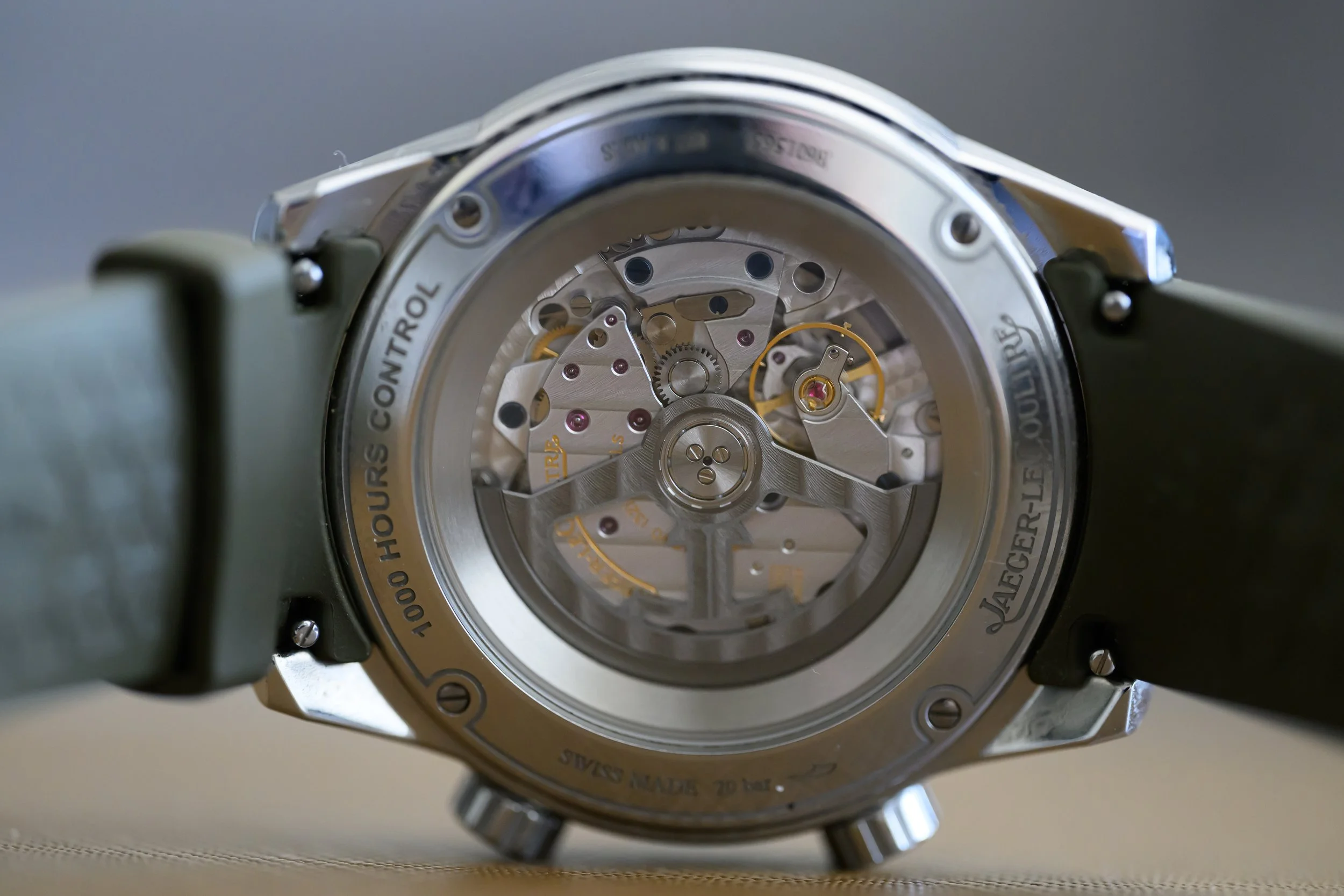
Over 112 days of wear, the watch has averaged +3 seconds per day. This includes a brief episode of magnetization (resolved quickly at a JLC boutique) where it spiked to about +10 seconds. This confirms that the 1,000 Hours Control process delivers very good chronometry, though it may suggest some vulnerability to magnetic fields. In terms of aesthetics, caliber 899 is not an ugly caliber, but seen from the caseback it is probably one of the weaknesses of the Polaris Date. Firstly, the contrast between the open-worked tungsten rotor and the shinier texture of the movement is not particularly harmonious. It’s basically a dark metal against a shiny metal, which I find rather unappealing. Moreover, the movement appears noticeably smaller than the case, so you will be looking at one of those display case-backs that are obviously displaying a movement that is fitted as an afterthought into a case yet probably designed for a much smaller one. I would have traded that kind of display case-back for some more water resistance, for example, but I am not sure that a younger collector (or a single-watch person) looking for a daily wearer would agree on this point. In general, I am not a big fan of the case, but it’s hard to say why: I think it’s a little bit too simple for the price point and perhaps too round in combination with the vintage-inspired shape of the sapphire crystal. At times, the watch comes across as having this UFO-esque roundness, as if wearing a green sphere devoid of sharp surfaces.

I always thought that my first JLC would be a Reverso, but given my lifestyle, I do think that the Polaris was a better choice. At the time, it also scratched the itches of both the green dial and faux-tina trends (and very gallantly so). All in all, I am super happy to own it and I recommend it very highly as a great entry point into JLC for collectors who don’t own this brand or as a daily driver for someone who is just starting in the world of watches.
Pros:
The dial. It’s insane. It’s almost black under a certain light, dark green in another and glows like an emerald under the sun. It is a real sight to behold.
Great wearability: Great dimensions, a power reserve that allows you to drop it on Friday and pick it back up on Monday and a very high quality green rubber strap paired with a double folding buckle. It’s an excellent daily driver that wears well with sporty outfits and more casual ones (especially if your wardrobe has a lot of ochre tones). I find myself reaching for it very often.
The lume. It is abundant and neatly applied to both the hour markers and the numerals. It is very cool indeed.
The vintage design cues with a clear reference to the legendary Memovox, including one of the best renditions of faux-tina that I have seen in a sports watch.
Cons:
The skeletonization of the faceted stick hands. Maybe I am missing something, but I find no real purpose for it.
The display case-back: The movement is much smaller than the case and it shows. The tungsten color of the rotor is not a good match for the shinier metal in the movement. In general, the overall finishing of the exhibition case-back is not great compared to the obvious alternatives at the price point.
It runs at an average of +3 seconds per day after 112 days of wear and it appeared to catch a severe case of magnetization where it ran at around +10spd. I would hope for better chronometry.
I am not sure about the innner rotating timing bezel. I barely ever use it and it feels slightly inaccurate and flimsy when operated via the crown at 2 o clock. Once rotated, is not easy to realign the markers of the bezel with the hour markers.
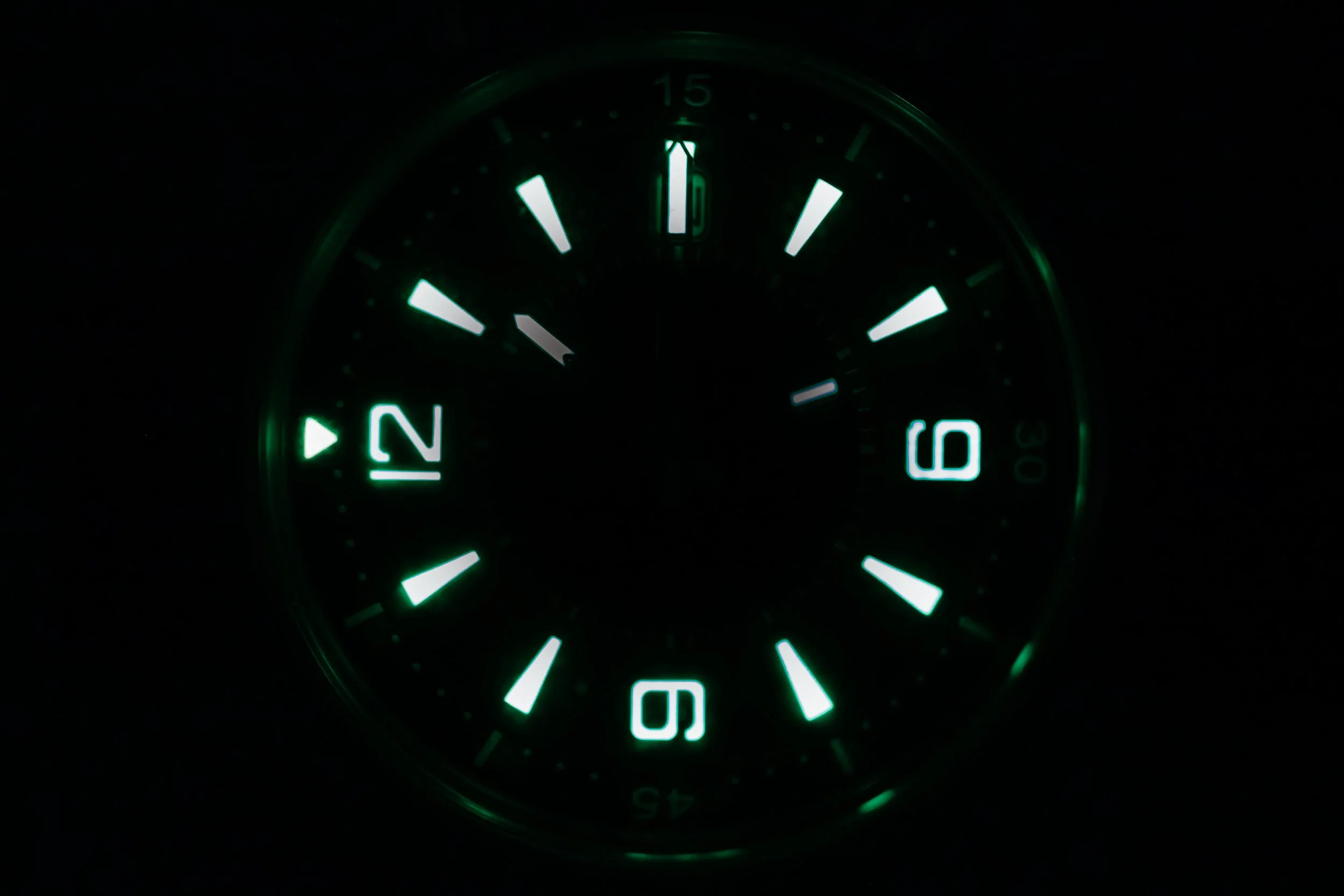
I am a fool for numerals with applied luminova, and this watch delivers on that front with flying colours.
Other watches to consider at this price point:
In my mind, the watch to beat at this price point is Omega’s Seamaster Diver 300m. It has 15 fewer hours of power reserve, but it is now an iconic design (especially in blue) and a staple in Omega’s line-up, now fitted with a Master Chronometer. If I were to buy my first watch ever, the Omega would be my choice, but this Polaris Date is a great proposition for anyone who is looking for something relatively off the beaten path. Choosing this JLC instead of the Omega tends to suggest that you own a few other fine watches and that you are not trying to impress anyone with your “James Bond” watch. It is much likelier to find someone wearing the Seamaster in the Subway, especially if you consider that the JLC in its green dial execution is a boutique edition. I suppose the Polaris is meant for someone who is already slightly deeper in the watch rabbit hole. It’s the choice for the watch guy who would prefer his timekeeper to spark a conversation that has nothing to do with silly spy fiction.
Important Specs:
Reference: Q906863J
Power Reserve: 70 hours.
Movement: In-house Jaeger-LeCoutre Caliber 899A/1
Case Dimensions: Diameter: 42 mm. Thickness: 13.92mm
The review that made me pull the trigger by the Swiss Watch Gang: